Beyond Basic Brown: 2 tone deck staining ideas for a High-End Designer Look
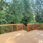
For many homeowners, the backyard deck is an extension of the living room—a place for morning espressos, summer barbecues, and quiet evenings. Yet, most decks suffer from a lack of visual “gravity” because they are treated with a single, monolithic coat of stain. While a solid cedar or mahogany tone is safe, it often lacks the architectural depth found in high-end landscape design.
If you want to elevate your outdoor space from “standard builder grade” to an architectural masterpiece, it’s time to rethink your approach to color. Embracing a multi-dimensional aesthetic is the most cost-effective way to add structural definition, highlight your home’s color palette, and create a truly custom look without the price tag of a full remodel.
In this guide, we’ll explore the design theory behind dual-color applications and provide specific inspiration to help you achieve that high-end designer finish.
The Philosophy of the Contrasting Approach
In interior design, we use “accent walls” to create focal points. In outdoor carpentry, we use color blocking to create visual hierarchy. By utilizing two different shades or transparency levels, you can manipulate how the eye perceives the space.
A darker vertical element, such as a railing, paired with a lighter horizontal element like the floorboards, can make a space feel more grounded and expansive. Conversely, a dark floor with light accents can provide a modern, “zen-like” aesthetic that mimics high-end interior hardwood flooring.
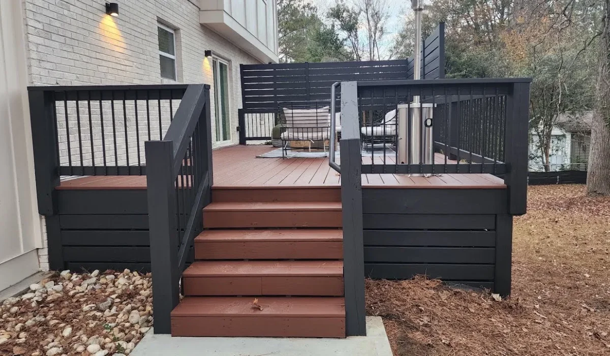
1. The “Tuxedo” Effect: Dark Railings and Light Floors
One of the most striking sophisticated combinations is the “Tuxedo” look. This involves finishing the floorboards in a light, natural tone—think honey gold, light oak, or a clear natural cedar—while treating the railings, posts, and stairs with a deep, authoritative pigment like espresso, charcoal, or onyx.
-
Why it works: The dark railings act like a picture frame for your backyard view, drawing the eye outward toward the landscape.
-
The Practical Perk: Lighter floorboards stay significantly cooler underfoot during peak sun hours than dark ones, making the space more comfortable for bare feet in mid-summer.
-
Designer Tip: Use a semi-transparent finish for the floor to show off the wood grain, but consider a solid or semi-solid product for the railings to provide a sharp, crisp contrast.
2. The “Inlaid Rug” Concept
If you have a large, sprawling platform, it can often feel like a vast “sea of wood.” To break up the monotony, use color to create a “rug” effect. This involves finishing the main body of the structure in one shade and using a contrasting, darker color for the “picture frame” boards—the perimeter boards that run perpendicular to the main floor.
-
Why it works: It defines specific “zones,” such as a dining area or a lounge space, without the need for physical barriers or walls.
-
The Technical Detail: This requires precision. Use high-quality painter’s tape designed for exterior surfaces to ensure the transition between the two shades is razor-sharp.
3. Coastal Sophistication: Driftwood and White
For homes with a beach or cottage aesthetic, mixing weathered greys with crisp white is a timeless choice. Finishing the floorboards in a “weathered grey” or “driftwood” tone provides a relaxed, aged look, while painting the balusters and fascia boards a bright, solid white adds a nautical, clean finish.
-
Maintenance Note: White vertical surfaces are much easier to maintain than white horizontal ones, as they don’t endure foot traffic or standing water. This look provides high-end appeal without a grueling maintenance schedule.
Execution: The Professional Secret to Clean Lines
The difference between a “DIY project” and a “Designer Installation” lies in the transitions. To achieve professional results, follow these three fundamental rules:
-
The “Top-Down” Rule: Always apply the lighter color first if you are worried about overlap, but generally, you should finish the railings and vertical posts before touching the floor. This prevents drips from ruining your finished floorboards.
-
Chemical Compatibility: Ensure both products are from the same manufacturer and share the same base, whether that is oil-on-oil or water-on-water. Mixing different bases can lead to bonding issues or peeling where the two colors meet.
-
Visual Balance: Use the 70/30 rule. Apply your primary color on roughly 70% of the surface area (usually the floor) and your accent color on the remaining 30% (railings and fascia). Overcomplicating the ratio can make the design look cluttered rather than curated.
Stepping away from the “one-can-fits-all” mentality allows your outdoor space to reflect the same level of intentionality as your home’s interior. By playing with contrast, framing, and texture, you turn a simple wooden platform into a custom architectural feature.